


For this week’s mid-week mini I thought I would revisit texturing. About a year ago, I wrote a blog post for Digital Photography School about texturing. The artists behind Flypaper Textures, were kind enough to let me interview them for the post and provided many tips and techniques.
One tip that has never left me, is the need to “get the sky right”. When working with textures, a specific texture can change the hue, saturation, and tone of the layer below it. I often find I get into trouble if the color of the texture I’ve chosen competes with the color of the underlying layer, or accentuates a color I didn’t want.
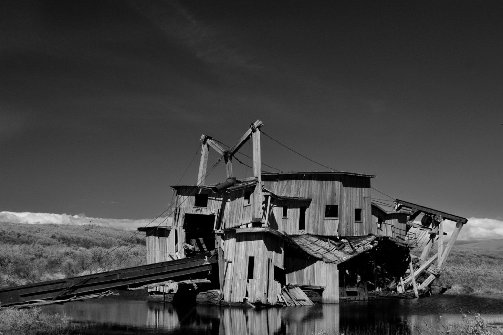
To get a sense of the power of texturing, below is the before image. I liked the movement, but thought it was lacking as a straightforward photograph. I have found when I start texturing an image, it may take me several tries to get a combination I like. It’s easy for me to spend at least an hour – often times much more because I end up discarding everything and starting over. It requires patience, a beverage, and many times an extra set of eyes to help you really see what you’ve created, and the ability to let go if necessary.


Leave a comment