

I’ve often been asked to share my workflow, and I admit the first thought that goes through my mind is “but that will bore you to death”. Now, after 13 years of living, breathing, and sleeping photography, I think that writing about my workflow will help me crystallize my own process and provide insights for how I might improve it.
So here we go with Episode #1 – An Outing to Hawaii’s Pu’uhonua o Honaunau National Historical site (I recommend to pronounce that name after a stiff martini while someone video tapes).
This is our third time to the historical site, and I am always attracted to the temples, the statues, and the beautiful ocean setting with the lava rocks and walls on the shore. This sacred place has a long and interesting history that is worth reading about, especially if you plan to visit. On this trip we made beautiful images of the major features of the site, but something else also caught my eye – bark. I have a fascination with tree bark (it goes up there with ripples in the mud), and an ever patient husband who stops while I photograph tree trunks, for what must seem to him, hours. I’ve learned to stop when something catches my eye, and look closer to try to figure out what it is.
Capture
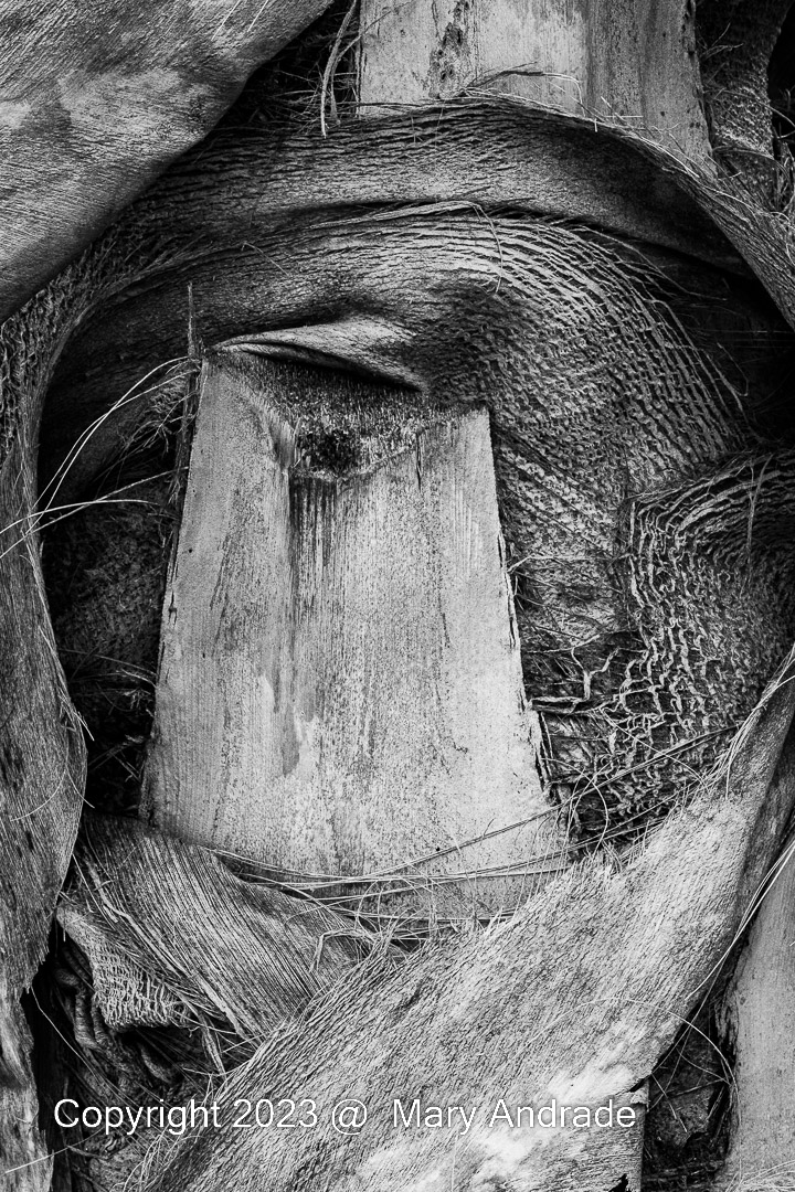
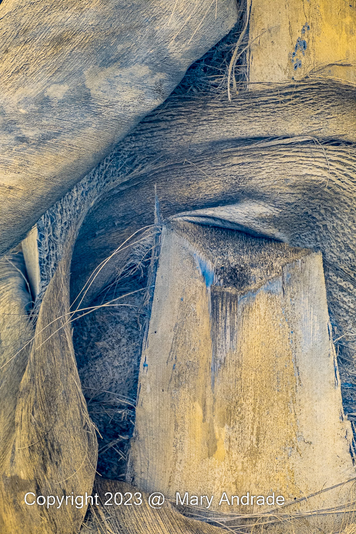
Hundreds of trees, beautiful landscape, and this one stopped me in my tracks. It defies the basic elements that make a good photograph: Subject, Background, Light, and Gesture. Some would say the subject is ugly, the light harsh, the background cluttered, and the gesture non-existent.
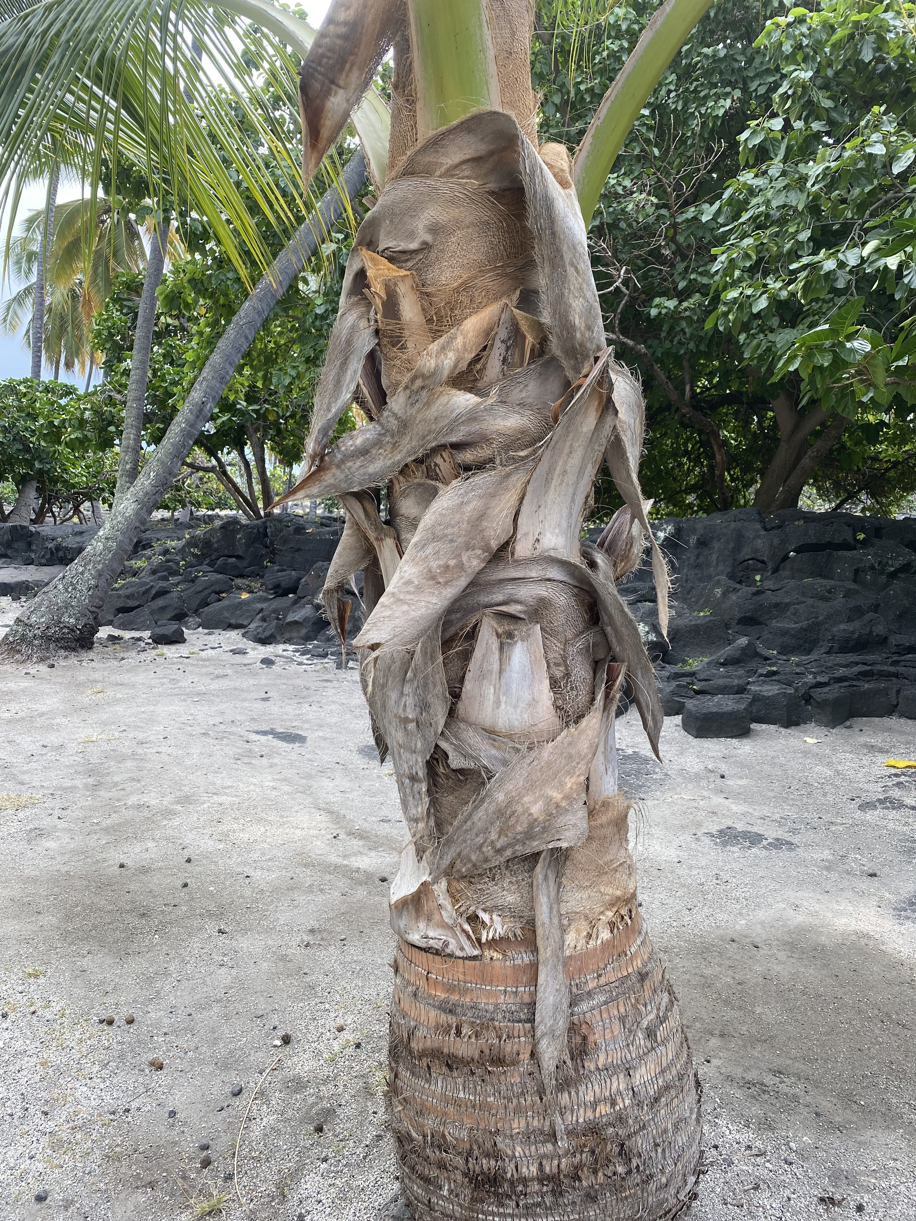
But, it stopped me. I wondered how many people must walk by it everyday and not even notice the fascinating patterns in the bark. There are places at the bottom of the trunk which create a linear pattern, and different geometric shapes in the middle. It was these middle shapes that made me stop. Once I zeroed in on that, my next step was to ask “Is color important here?”, “Is color a strong component to what stopped me?”. In this case the answer was “no”. I decided since it was the middle of the day, and color was not important to me, that I would photograph this subject in infrared. I set a custom white balance and shot 5 images, the only processing shown for these images in the next gallery was to convert the DNG profile for my Fuji Camera so I could bring them into Lightroom. To learn more about infrared white balance, creating a custom DNG profile for for your converted camera, and basic workflow for infrared, reference my blog, Workflow for Processing Infrared Photographs.


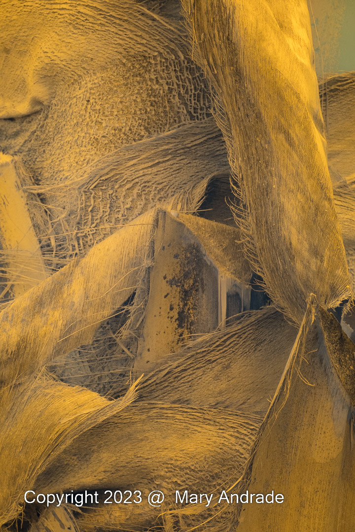
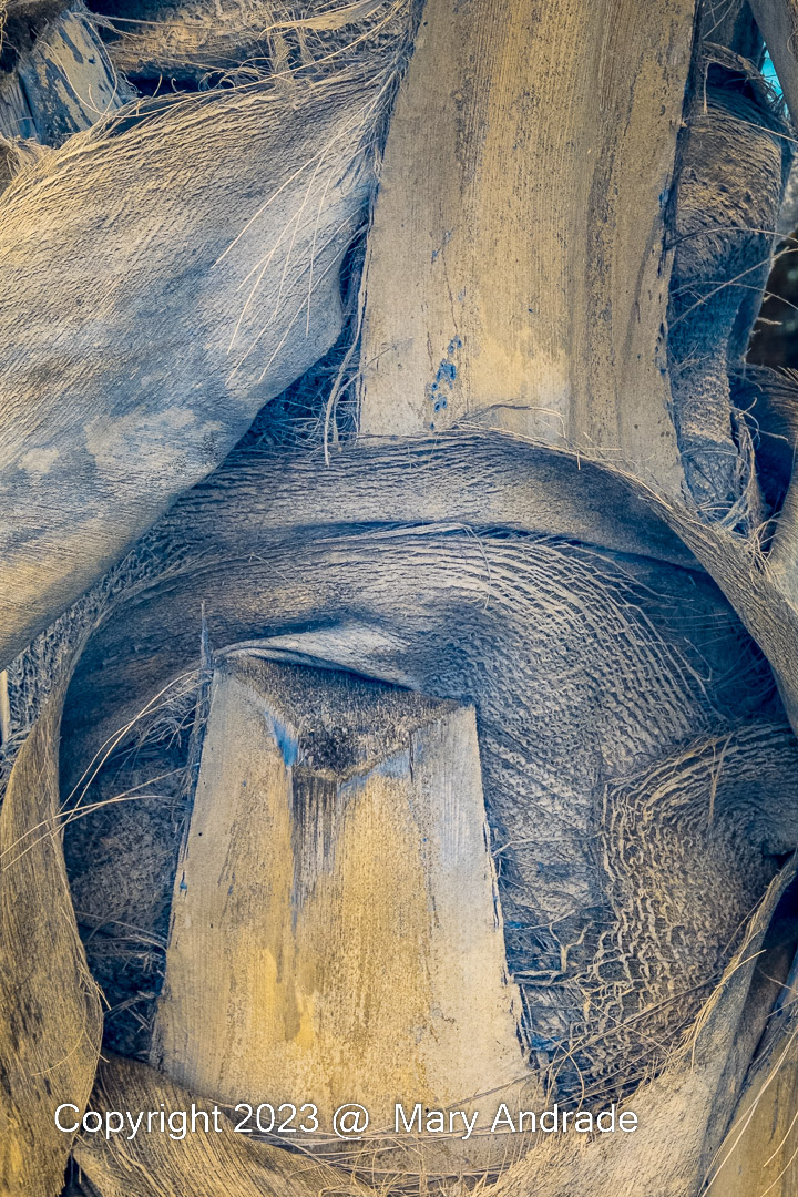
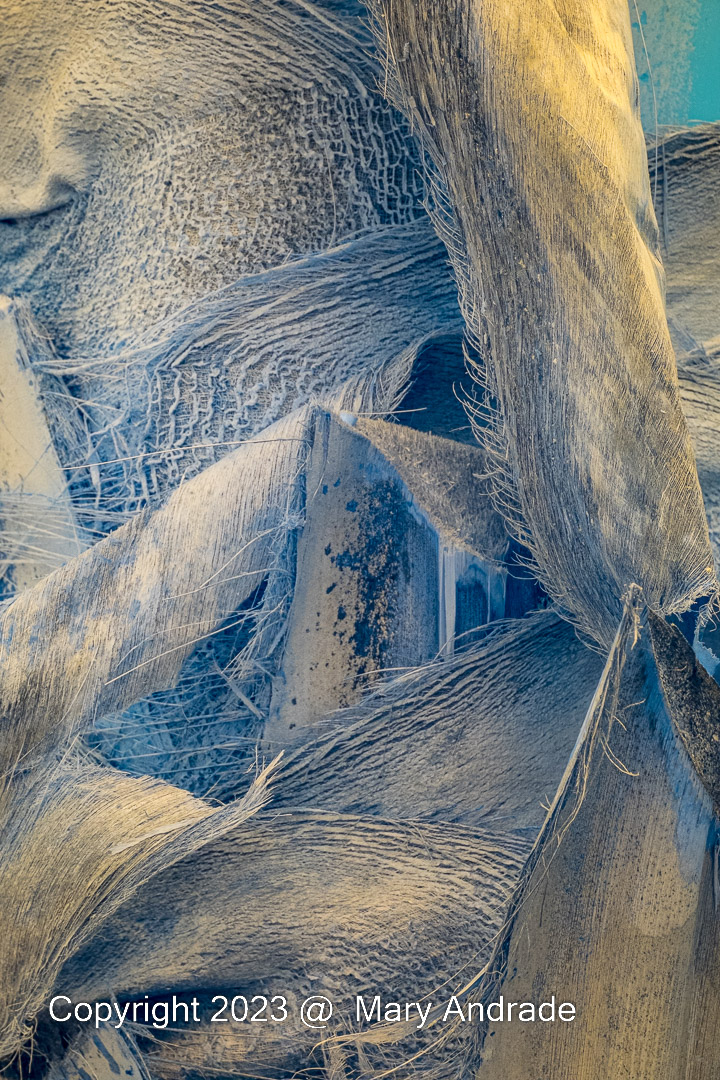
You can see I went in tight to isolate the geometric shapes and changed my composition in the first 4 images to focus on the circular arch at the top.
Processing
For these images I did all my processing work in Lightroom. I selected all 5 images, went to the Develop Module, and clicked Auto Sync at the bottom so all images would update with my basic adjustments:
- Changed the white balance using the eye dropper tool and selected an area of the image that is neutral “gray”. In this case, everything is the same tonality so I clicked in the middle.
- Used Auto in the Basic adjustments to create a starting point. Added Texture and Clarity and Dehaze (just a little goes a long way). Added more contrast
- Toggled off Auto Sync and cropped each photo independently. Now that I had the tones and contrast set, I choose which ones to take further.
Finish
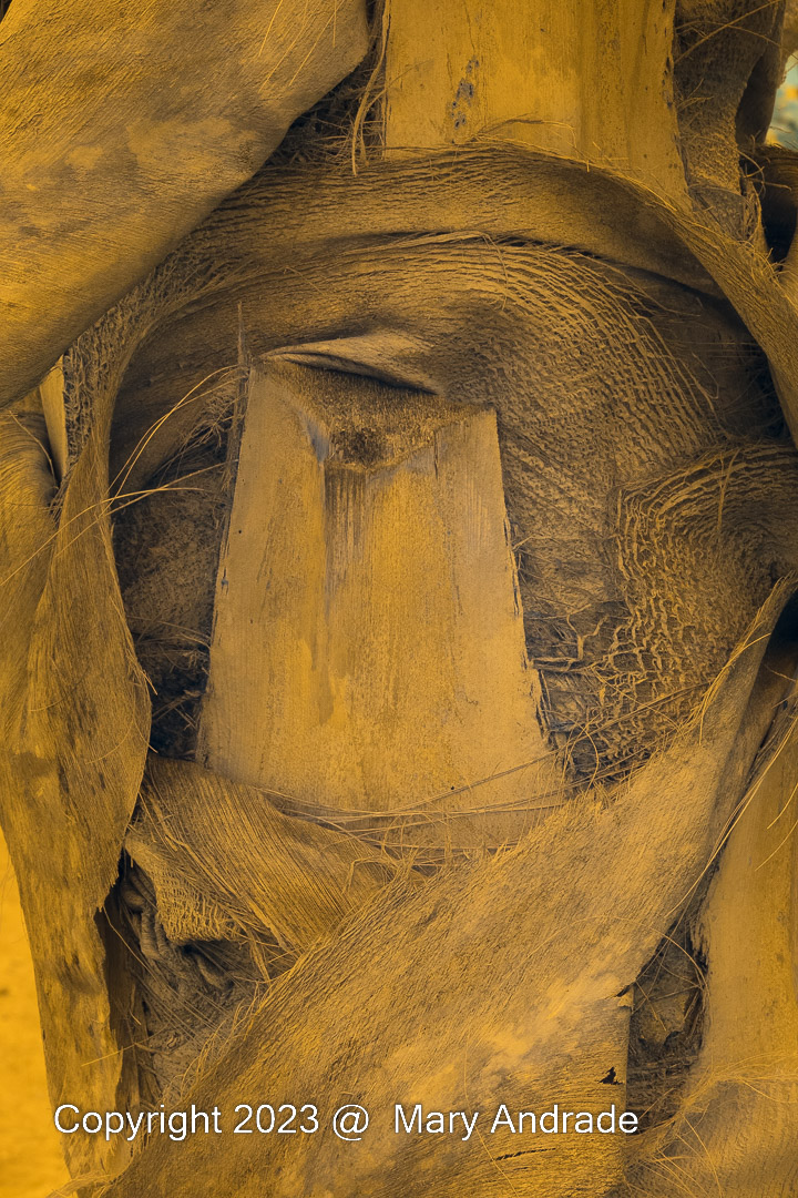
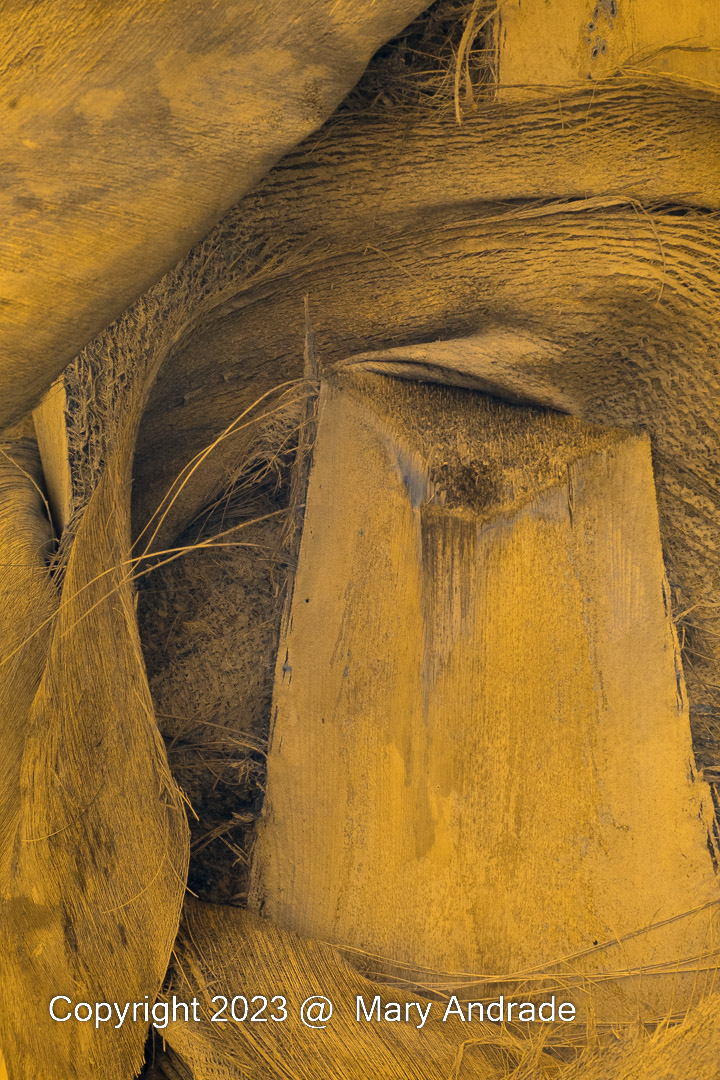
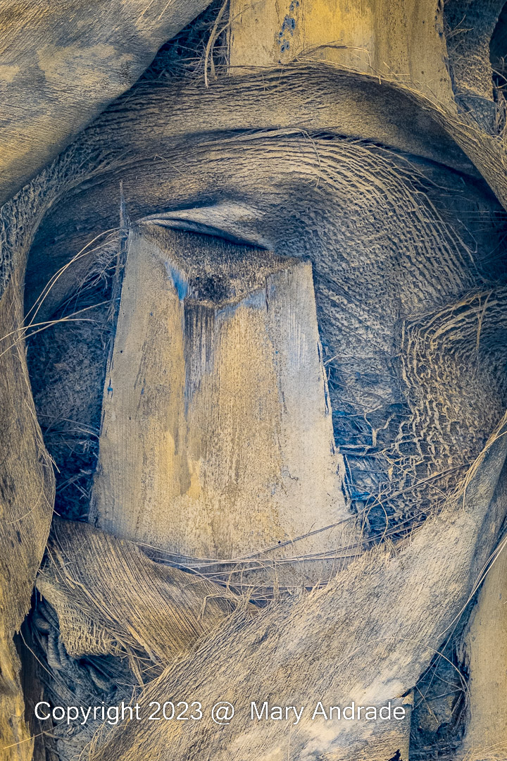
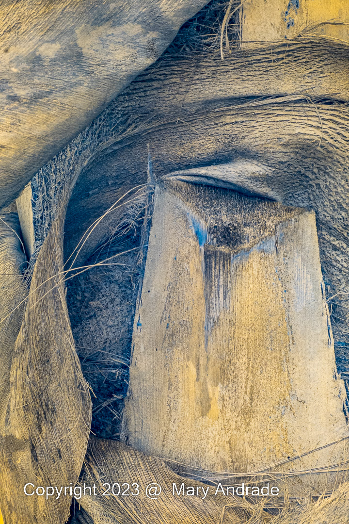
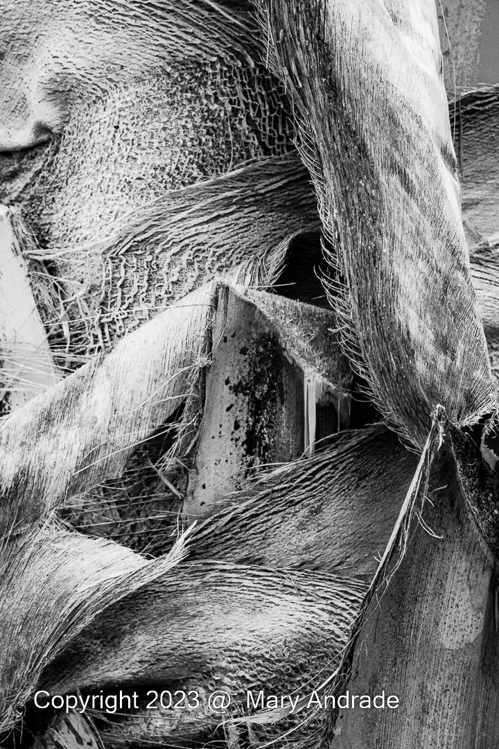
- For infrareds, I have options. I can create a color infrared where the foliage is pink, and the skies almost black. But in this case there wasn’t enough variation in color. It was all basically the same orange/yellow color with some blue/grays mixed in. I also thought it would be more striking in black and white. I choose three and then applied different Lightroom BW Profile settings. I like to start here. The profiles have a lot of variation, and about 70% of the time I find something that works well with the image. In this case I applied B&W4 to the first two images, and B&W Red to the last image. If I couldn’t find anything, I would have gone to a plug-in next and looked at options.
- On the third image, I added a slight vignette to increase focus on the center triangle shape.

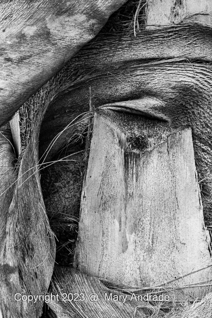
And if I had to pick just one to keep, it would be the first one. I like how the circular shape starts at the bottom and swoops around the center rectangle. This feels more balanced to me. I prefer the contrast of dark tones in the middle and light tones on the rectangular shape almost as if its a frame. The variety of smooth and rough textures also adds another element of interest.

Leave a comment