


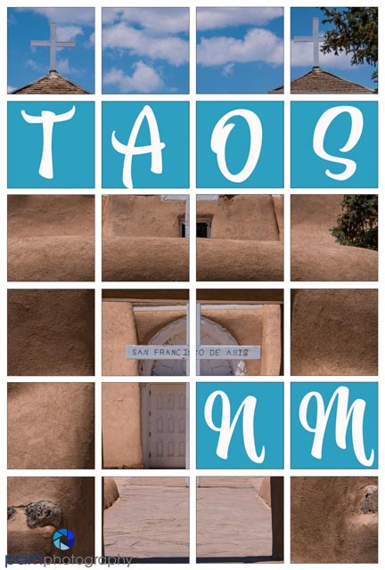
This week’s project comes from an article in Photoshop User magazine (when they were still sending printed versions – yes, I cut out the pages and kept them…..for 6 years). I like to see our images printed, so we typically make a photobook after each big trip, and I also create a yearbook in January summarizing our activities and experiences. This way I can capture special occasions, small outings, and trips that weren’t so fruitful as to warrant their own book. I’m always looking for creative cover pages, or ways to mark new sections of a book. So after 6 years I decided to tackle this Photoshop project and make a couple of pages for our recent New Mexico trip.
I searched for a link to this specific article on Kelbyone.com, but I believe you need a paid membership to be able to access it (if they post it on-line). The name of the article is: London on the Grid by Corey Barker. It is in their Down & Dirty Tricks section, and was published in January 2016 in the Photoshop User magazine. Kelbyone, and Kelby’s books and other materials have been invaluable resources to me as I learned about photography, Lightroom, and Photoshop. As a retired learning professional, I am impressed by the way Kelby and the team break down complicated processes into easy to follow step-by-steps. I still have my Lightroom 3 book by Kelby and sometimes will refer to it for specific techniques. While researching access to this article, I did find a book on Amazon by Corey Barker that may have some useful information. There are two volumes, here is the link to the one printed close to the time of the article Photoshop Down & Dirty Techniques Volume 2.
Out of respect for copyright, I will not copy the article in this blog. Here are the general steps I followed, and things I learned along the way.
- Use Guides. I have always been a bit paralyzed by all the lines and how to set them up. The article uses the New Guide Layout dialog in the View menu to set up the basic 4×6 square structure.
- Create Multiple Copies of the 4×6 square structure. You need two copies of this structure, one to clip the image to, and one for the text. Because you need to delete some of the squares to show the picture underneath the text, make multiple copies. That way you if you decide to change the placement of the text, you won’t have to recreate the squares.
- Path tool for letter placement. I had not really used this tool, but found it helpful to center the letters in the box, and to also select all the squares that did not have text and delete them at once.
- Choosing a font to match your location. A couple of years ago I went down the “font rabbit hole”. I discovered I had access to fonts.adobe.com, and how easy it was to activate new fonts. For these two cover pages, I Googled, Santa Fe style fonts, and found one I liked. It was not available on Adobe, but they have a Visual Search feature in which you drag and drop an image of the font and it pulls up similar fonts in their library.
- Add the photo. This was the hard part, finding an image with the right orientation, contrast, and composition to work around the text. The article suggests changing the image to monochrome and adding contrast, but I decided color fit better for the locations I was using.
After this project, I am now curious about other cover page designs and how to introduce sections in our photobooks……I sense another rabbit hole in my future.


Leave a comment