


I started texturizing my images years ago. I’ve tried different textures, different plug-ins that are supposed to make things easier, but I find that I go back to the workflow I learned from Paul and Jill at FlyPaper Textures. I wrote a post for Digital Photography School years ago, in which they outlined their best practices. I still use those techniques today. This blog is a slight variation on those techniques which I used when I’m texturizing portraits.
Tip 1: Find a “gentle” texture for the background. Paul Grand at FlyPaper Textures shared, that you have to get the sky right and then everything else will fall into place. I found with portraits that applying too much texture of the background competes with the subject. In this portrait, I applied creative effects using Nik Color Effects Pro, and then applied a texture that resembled clouds in the sky.
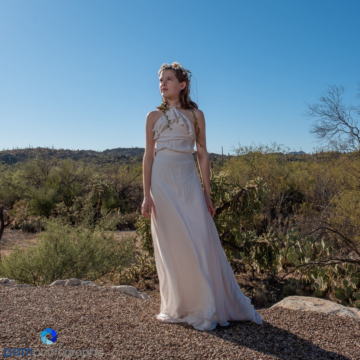
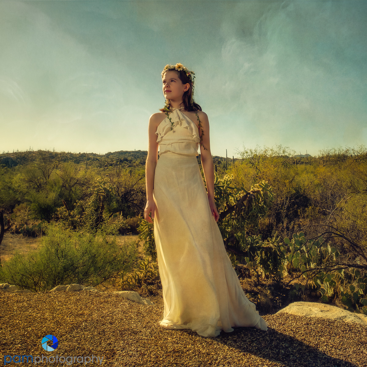
Tip 2: Remove the texture from the skin, particularly from the face. Texture and skin don’t go together, unless maybe if you are creating a supernatural creature. The challenge is to make sure when removing the texture the untextured skin tone doesn’t clash with the rest of the textured color in the image.
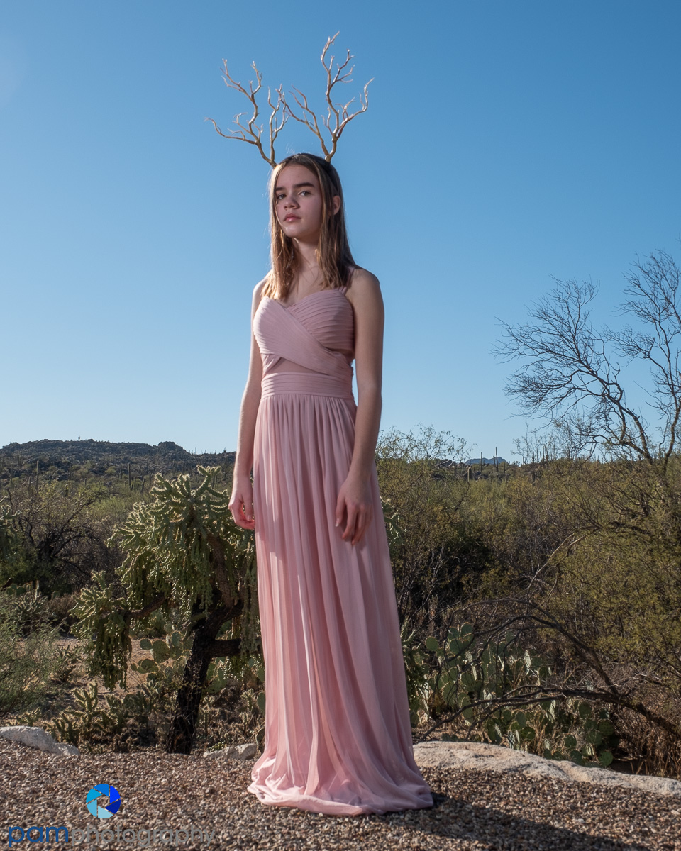
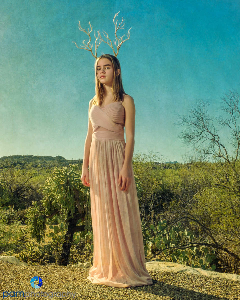
Tip 3: Reduce the opacity of the texture in smooth areas on the subject such as the clothing. This takes a little trial and error. As you can see in both portraits, I left some of the texture on the dresses. I felt the grungy texture of the dresses went with the nature theme of the image.


Leave a comment