

So how important is color really? I mean I have a lot of people tell me that black and white photographs are “real art” – so what are the color ones? Nice posters? Maybe this is a debate we can take up here at pamphotography.
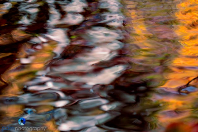
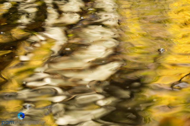
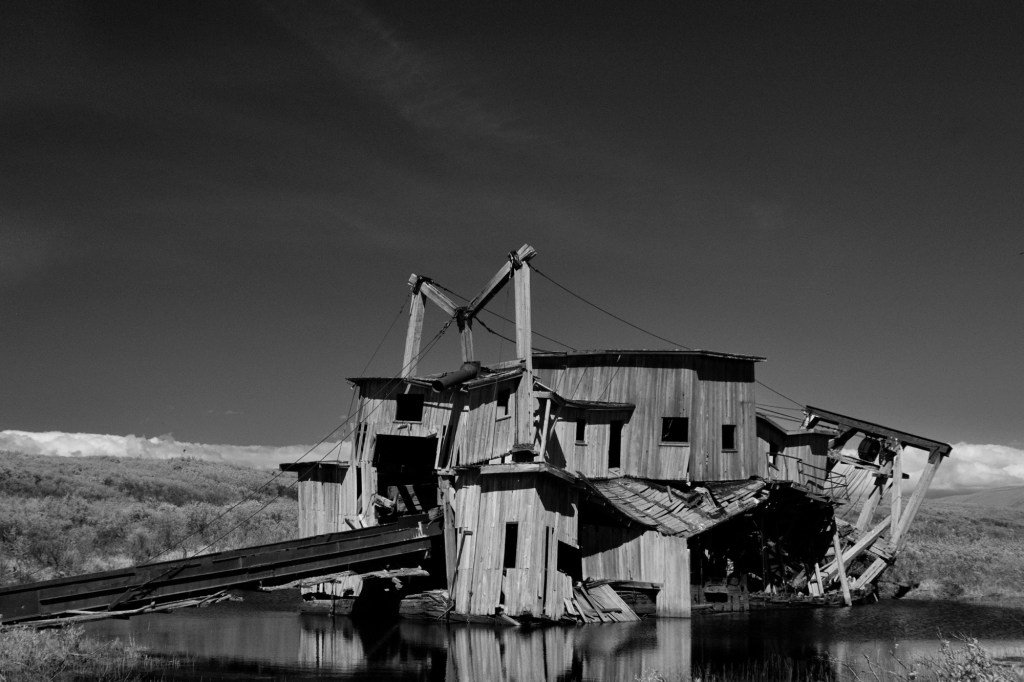
I love reflections, usually its the color that draws me in, but then its the shapes and movement in the water. Often times I will get home and realize, I’m not really excited about the colors that drew me in in the first place (especially if they are those anemic 70’s golds and greens.
A few weeks back I posted a set of sunflower abstracts where I had those 70’s colors, and changed them using Topaz’s Restyle. This is one of my favorite creativity tools. When I look at a raw image my first question to myself is “what do I wish would be different” – then I go from there and begin to make my adjustments. Given all the creative options available, if I don’t start with that question, I would be wondering through a creative candy store aimlessly sampling and ultimately ending up with a headache.
When my first response to the question is “what do I wish would be different?” is “the color”, Topaz Restyle is my go-to software. Its usually not as easy as looking through a few presets – they have over 1000. So my next question usually is “do I want this to make a ‘pow’ statement, or do I want this to make a ‘quiet’ statement?”. That usually depends on the lines and motion in the image. In this image there is a lot of movement, so I went for “pow” and picked strong opposing colors.

Leave a comment