


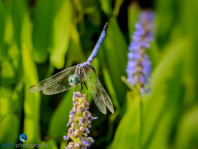
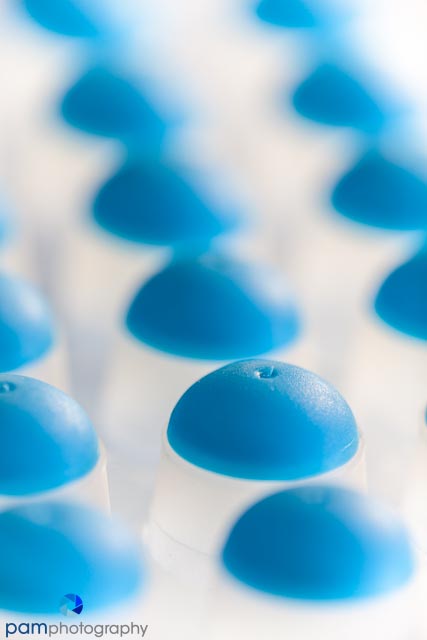
This week’s project was to photograph a color – I chose blue. Blue is not as common as I thought. It’s a primary color, so it should be everywhere. With the exception of the sky and ocean – green, red and yellow are more common colors. So I hit the dollar store, the craft stores, the candy machine at work (and my poor co-workers who just happened to get some blue candy in their mix) and set off to see what I could do.
I had difficulty finding blue items in my everyday environment (except for men at work who will wear nothing other than blue shirts). I had more fun on the processing side, than on the capture part of the exercise. Blue can actually get to be pretty boring after looking at it for an entire week.
So here are this week’s top pics (please note that no candy was sacrificed in the making of this post – it was actually pretty gross by the time I was done with it). To see in full screen mode, click on an image to access slide show view.


Leave a comment