

Last week Peter posted his processing tips. As you may be aware, Peter and I have differing opinions on photography and what makes a great photo. I felt the need to present an alternative view this week, and perhaps spark a debate.
Peter started his post with outlining you that you needed to have a good photo to begin with. While I agree that processing will not make a bad photo great; I don’t necessarily agree with all of his assertions. Some of my favorite photos don’t follow the rule of thirds,and aren’t sharp throughout. Below is a summary of my basic workflow using Lightroom- you might see a difference in our process, styles, and preferences. I hope it illustrates that processing a photo is a valuable artistic input into making a beautiful image. After you learn the basics, it is really your unique vision that makes the transition from “taking a picture” to “making a photograph”. [Note: These steps apply to my color images. I use a different set of steps to process my infrared images]
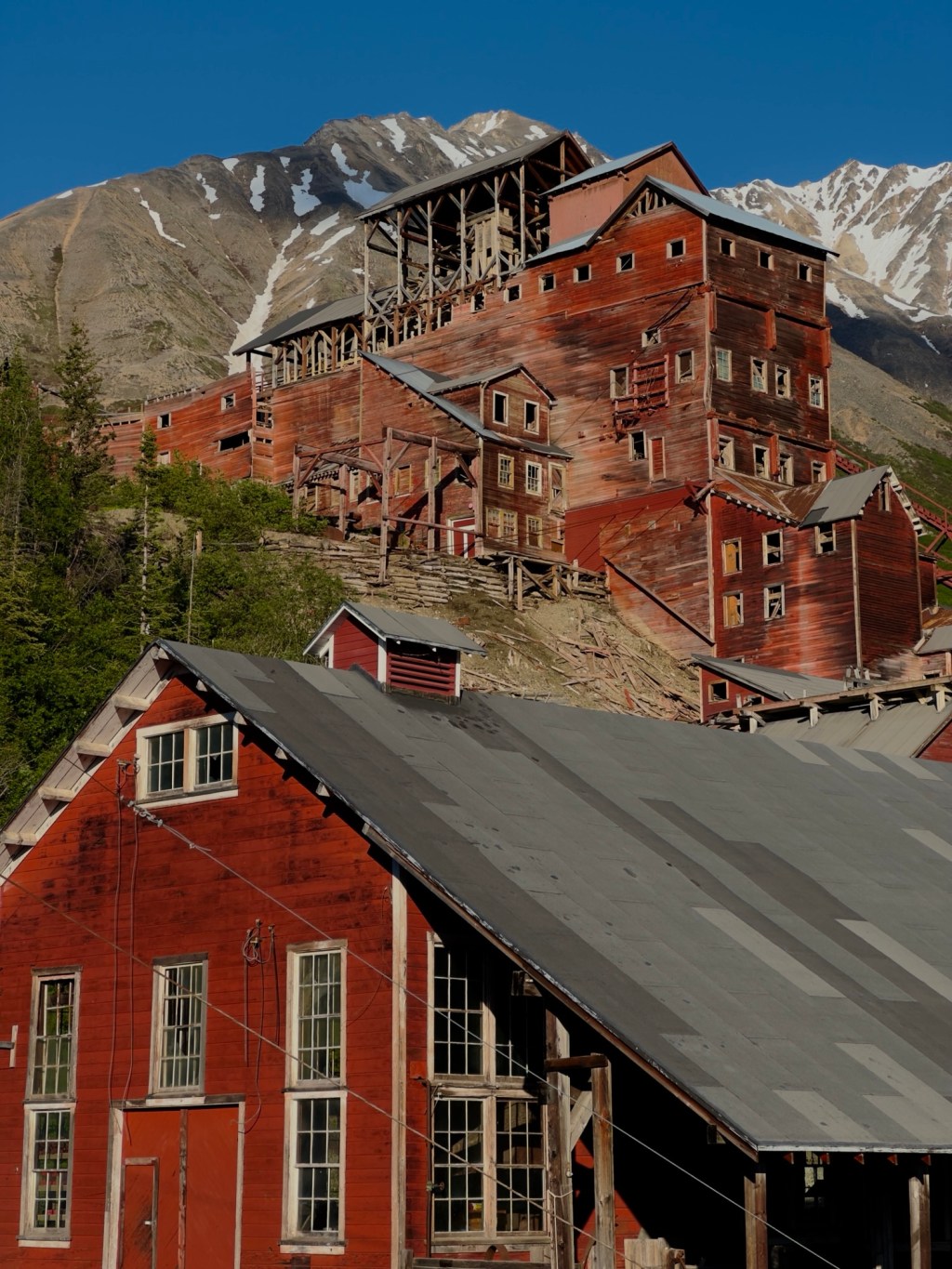
Here is my starting image, raw and straight out of the camera

Step 1: Remove the sensor spots, distractions etc.
When I see images with sensor spots, it’s like reading the New York Times and seeing a typo. It just stops me in my tracks, and leaves me disappointed. Lightroom has a quick and easy way to make a thorough first sweep of the easy stuff. Change the Navigator at the top left to 1:1, place the square in the top left corner and press Page Down. This will systematically go through the entire image for clean up.

Step 2: Light room adjustments
I make a series of basic adjustments using the righthand panel of Lightroom. I start at the top and then work my way through to the Vibrance adjustment. Adjustments I typically make include:
- White Balance – I alter whether the image has a cool or warm temperature.
- Exposure – I may make the image lighter with this adjustment; but typically prefer the Brightness slider so I don’t overexpose the highlights.
- Blacks – Usually, I will move the slider to the right until the triangle on the left of the histogram turns white. This sets a black point, adds contrast, and creates perceived sharpness in most photos.
- Brightness – After adjusting the Black slider, the image is usually dark, so I will increase the Brightness.
- Clarity: I add Clarity to increase sharpness, but have recently found myself reducing clarity in images that have a lot of small particles (like pollen on a flower), or that I want to appear smooth and painterly (like scratched up canoes).
- Vibrance: I make small adjustments here to bring out the color.
I do not typically adjust Contrast. I find the effect too harsh for my tastes. Here is a screen shot of the adjustments I made on the above image for you to compare the before and after. Note that I did not push the black slider to make the triangle on the histogram white; I found this made the image too dark. I did come fairly close to the edge.

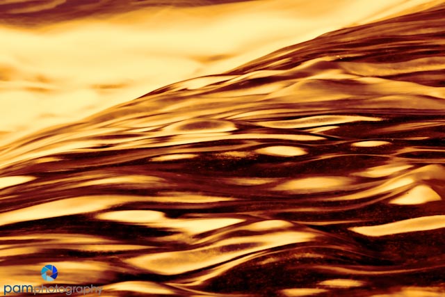
3: Playtime – exploring creative effects
When I look at this image I think of liquid gold. Not sure why (maybe it’s a subliminal hint to my husband). It would take me hours to go through all of the creative effects I have available through different plug-in applications. I usually start with the an idea of the look I want to create, then try out the filter I think will give me that effect. For the final image, I chose Topaz’s Black & White plug-in. I am a huge Topaz fan. Their products provide a ton of creative effects, and their price point is really low for these types of products. They do offer a free trial period if you want to check it out. Ironically enough, I typically don’t use their Black & White plug-in to make black and white images. I tend to use it for more color toned images. I plan to write future blogs on some of the plug-in’s I have. If you are interested in a specific product let me know, and I will move it up on the list.
For the final image I applied the Quad Redscale preset. I decided to tweak the color more, and took the image into Photoshop to change the hue and saturation. (you can also do this in Viveza).
As you can see it’s quite a bit different from the original raw file. I would recommend if you have a photo that you are unsure about whether to keep or not, to save it and play with it when you have some free time. Who knows it may end up to be one of your favorites.
You can see more of our photos at pamphotography.com

Leave a comment