


A “few” years ago, I committed to one photography project a week for a year. It was my version of Project 52, and I completed in 54 weeks. I told myself, when I retired, I would tackle my 3″ binder full of project ideas, and a spreadsheet with 100+ ideas. Now 2 1/2 years have passed, and I figure I better get started. I won’t do a project EVERY week, but will try to do 2 or 3 a month. So first up on the Photography Project reboot, creating a mosaic with my photographs.
This project idea comes from Digital Photo magazine (as many of my projects do). This is a great magazine especially when you are just starting. I created one mosaic using the templates that were provided, and then created my own using Flypaper’s Tintype Edges in case you wanted to give it a try too.
Step 1: Create the mosaic background. I found 6 squares too few, and settled on 24 as the best. You will need: A dark textured background and 24 square shapes with texture all in monochrome. Don’t worry about the edges aligning, it adds to the vintage feel when they don’t (at least that what I tell myself.
Step 2: Add your image. Choose an image with a strong subject that can hold its own against all the texture. Convert it to monochrome. Change your blend mode to incorporate the image into the background. I used Overlay the most. Play with the positioning of the image to ensure the most important part of the subject isn’t marred by seam lines from adjacent textures. This is especially important with tighter portrait shots.
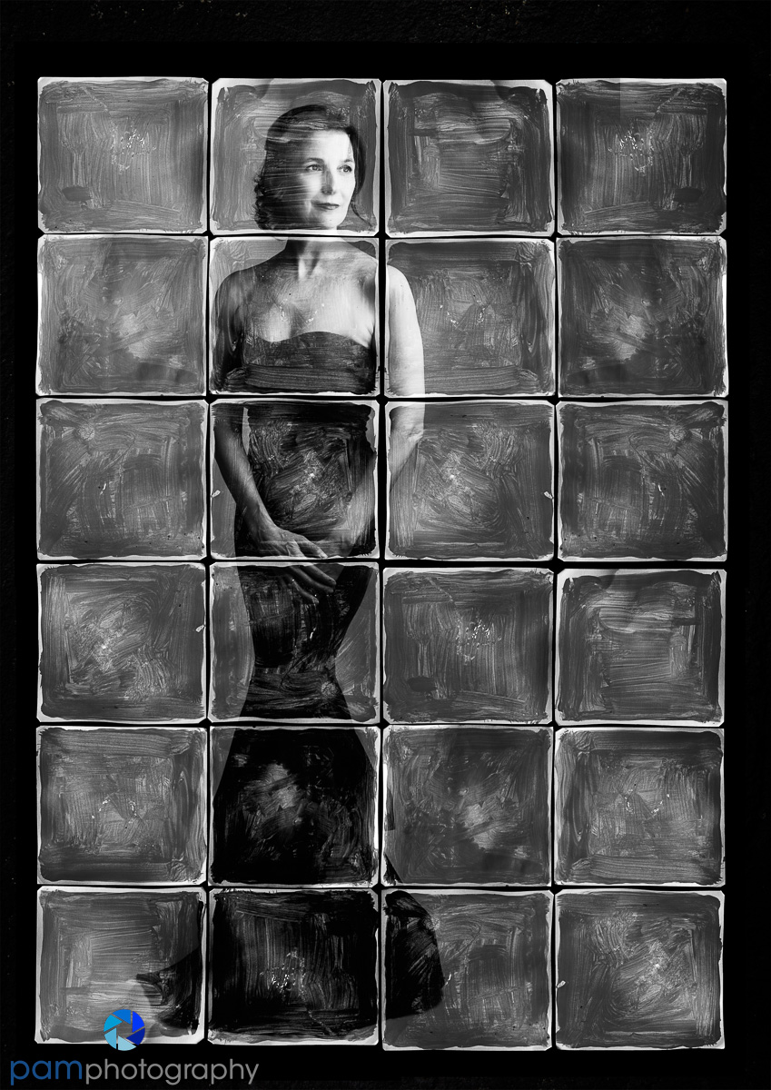
This image was created with DP Magazine’s templates. The seamlines are heavy. I wasn’t able to position the face where I wanted, and have the image cover the tiles. So I copied the side of the image and patched it to the right. You can still see a bit of the patch in the upper right tile. Unfortunately, I wasn’t able to find these templates on line (I subscribed to the magazine when they were still including DVD’s with the project files).
Step 3: Lighten the image. I clipped a Curve adjustment layer to my image and lightened to bring forward more detail.
Step 4: Lighten the whole image. I found all three of my final composites to be very dark; I added a curve adjustment focusing on the levels of contrast.
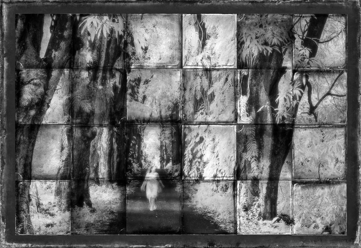
This image was created from a template I made with Flypaper Tintypes. If you choose to make your own, vary the direction of the tiles using Free Transform. In this case I used 5 different tiles and changed their direction each time. I’m not crazy about a seam going through the middle of my subject, but it was difficult to find a way to extend the image without losing a lot of the dramatic background.
Interestingly enough, my favorite image from this project, was one I didn’t even bother processing after I made it. I thought the original image was too messy without a strong focus, but in this format I think the sign is prominent and can hold the composite.


Leave a comment