


I like to experiment with my images, but one technique I find myself coming back to over and over is adding texture. I’ve written a few posts in the past on how to texture, and showing images with texture, I thought I would re-visit this topic and show a few before/after images.
If you’d like to read a step-by-step on how to add texture to an image, I would suggest starting with an article I wrote years ago for Digital Photography School called Tips for Texturing Photographs. My favorite texture packs are still Flypaper Textures, and I would recommend reading the “recipes” they provide on their blog and tutorials to help get started. I have also been photographing my own textures, and working with National Geographics and Citrosolve to create my own. Perhaps a good topic for a future post. Lastly, if you’d like to read some of my historical posts, use the Search bar on the right of any post page (sadly, I can’t place one on my home page. Search with the key word term Texture.
Now onto Before and After images. I love taking pictures of wildflowers, and often find I am out in the fields when lightening conditions aren’t ideal. Peter usually finds some very long hike, and if I’m honest with myself, I am not going to get out of bed that early if I have to exert myself that much. So back to the topic: beautiful flowers + tough light= perfect opportunity for adding texture.
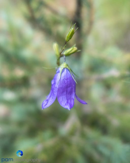

This simple image of a small purple flower needed something more interesting. I found the brighter texture helped mask the variations in the background. This along with the yellow compliment to the purple accentuated the small flower.
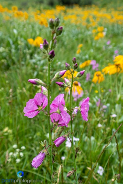
Photographing wildflowers in a field can be messy. It cam be hard to isolate a particular flower, or the flower itself is not a strong enough subject to hold the image. In this case, I used a similar approach (and perhaps texture). I brighter, yellow-toned texture helped to emphasize the pink/purple flowers.
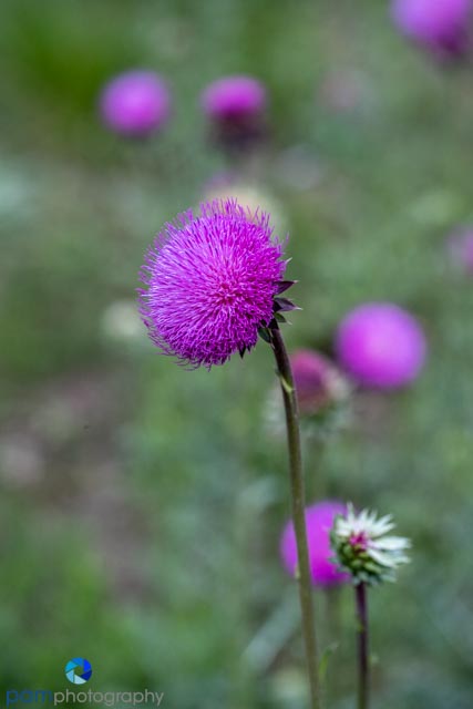
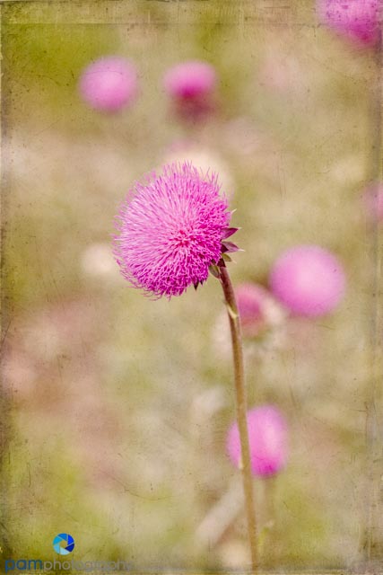
I love a pretty thistle. Its textured flower and bright purple color can keep me captivated for an hour. In this before and after, I removed the white bud to prevent drawing focus away from the flower, I went with a more muted texture over the bright green, and I added a tin type border and reduced the opacity. All of these textures are from Flypaper Texture.
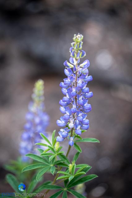
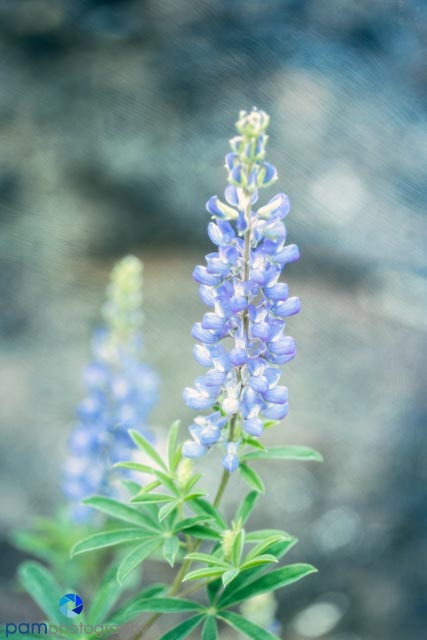
I went with a different direction here. I decided to play on the cool color of the flowers and choose a texture with a similar feel. This one had less of a painterly feel, and more of a harsh metallic feel with the streaks throughout.


Leave a comment