
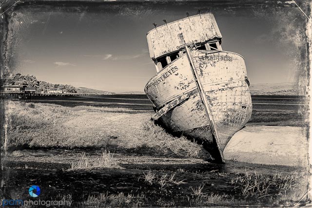

I love the old-time look of tin type. I first discovered it in Alien Skin’s Exposure plug in; and was absolutely delighted when Hipstamatic introduced their new TinType app so I could play with it on my phone where ever I was. After exploring different techniques, here are some tips.
- Choose subject matter that “fits” with the old-time look. At first I started with environmental portraits, but found the modern elements conflicted with the overall look and feel. If you do a portrait, focus on just the face. I prefer the “old stuff”: cars, lighthouses, etc.
- Decide if color makes sense. With TinType you can choose from black and white, sepia, or color. I have found I prefer black and white. It doesn’t seem to overlay additional meaning to the image. For me, color seems to modernize the image which is in conflict with the tin type era.
- Choose a strong subject and center that in your composition. This goes against the typical guidance around rule of thirds. Because the edges are roughed up, there is blurring around the image, and there are textures added, I would recommend creating a strong central focal point.


Leave a comment