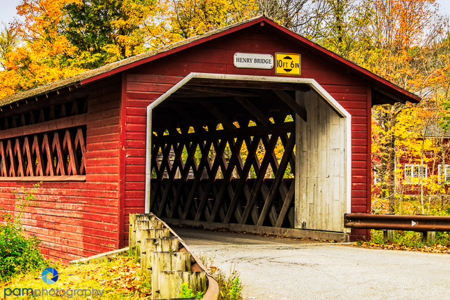
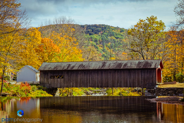
Vermont has nearly 100 covered bridges. While crisscrossing the state a month ago looking for fall color, Mary and I visited quite a few newer and historic covered bridges. We were initially disappointed in the “ugly” scenery around many of the bridges, but when we got home, we used creative processing to bring out the essence of these fine old structures. Here’s how.
Most of the time, there were a lot of signs, guardrails and other material around the bridges that were not very photogenic. We also saw a lot of construction. You really have to work these subjects by walking all around them and even under them. Different focal lengths and camera position made a difference.
Finally, many of these bridges looked much better in monotone rather than color.
Getting under the bridge can give a unique perspective.
Surprisingly, we did not have that much fall color near the bridges, hence the monotone.
When we did see fall color we tried hard to incorporate into the composition. Red, blue, yellow, and green all go well together.
The Green River bridge was under heavy construction on both ends. I walked down river a couple of hundred yards to get this shot.
We used David Middleton’s, The Photographer’s Guide to Vermont and two Photograph America newsletters from Bob Hitchman. We also bought a Delorme Atlas. You can not imagine how valuable this large paper atlas was. Most of the places we went to did not have cell service and the dirt roads are confusing and not obviously signed. I think we are all spoiled with GPS and cell phones now and under appreciate a good road map. If you really want to go to Vermont, this atlas is a must.
This is the last blog from our Vermont trip.
Here is our first Vermont blog and here is our blog about the Jenne Farm. This one is about Vermont Barns; this one is about pond and lake reflections; and this one is about streams and waterfalls.
Last week’s blog was about Vermont Fall Color.
To see (and buy) more of our photographs,please go to www.pamphotography.com.





Leave a comment