


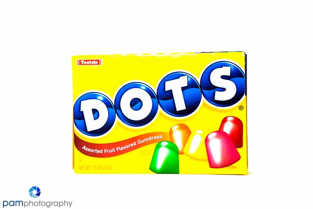
I first became enamored of product packaging when I stumbled on a product called “Mary’s Gone Crackers”….it was so ridiculous (and disturbingly appropriate). I love the graphic nature of packages – bold primary and secondary colors (and the candy is tasty too).
I grabbed these great packages in the checkout of Bed, Bath, and Beyond – contrary to popular belief, I selected them for their colors. I set up my table top studio, and decided this would be a good opportunity to work with my flash (in the desperate hope that someday I will actually figure out how to use it). I was surprised to notice how much stuff some packages had on the front , and others were minimal. I prefer minimal (for photography………not candy).
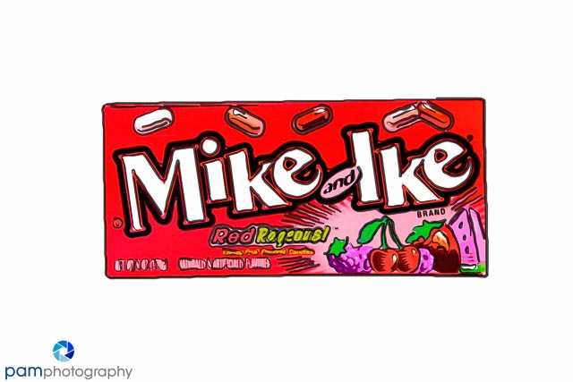
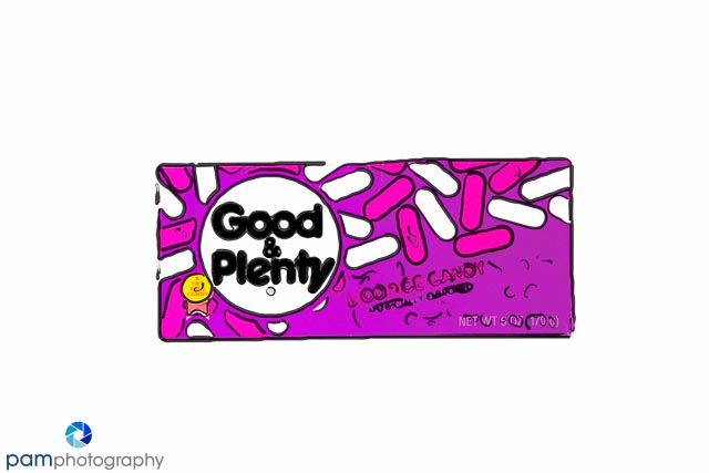
This is one of those projects where I could spend hours on the processing side, applying different styles and approaches. Here is a sample of what I tried:


In a future project I plan to explore packaging of different ethnic foods, as well as creating a collage of products. Much to Peter’s chagrin, a friend of mine sent me a Lumi kit – so I’m dying to create a negative of some of these packages, and apply it to wood (he may actually move my operations out to the garage for that one).


Leave a comment