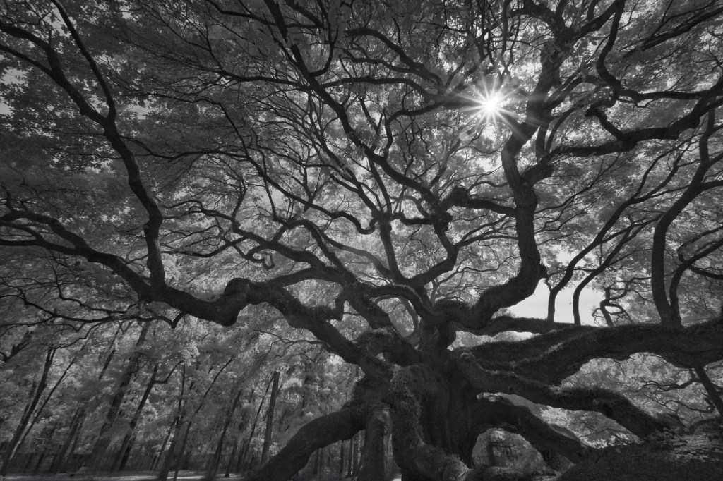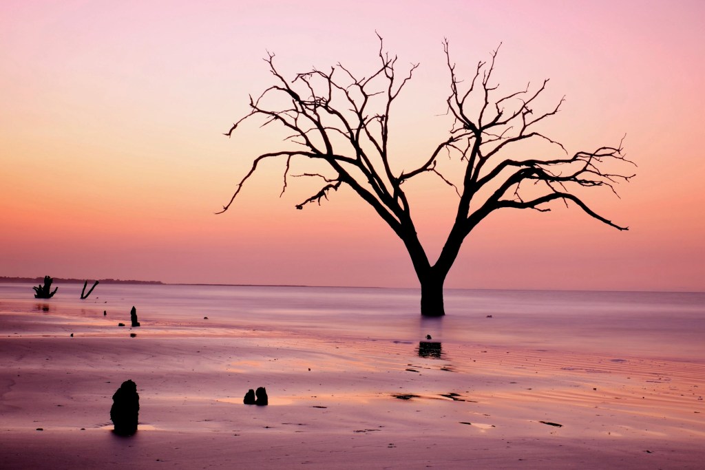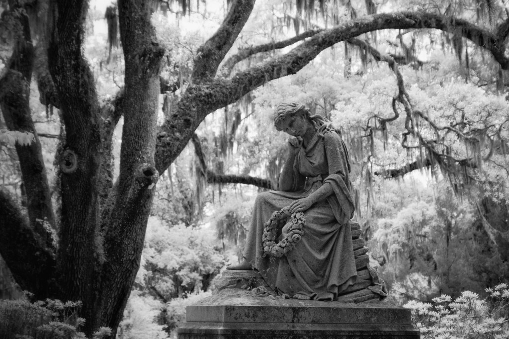
Sometimes I wonder if our visual sensibilities have been “over-juiced” with high-contrast, highly-saturated photos. When I started working with a mat style approach something in the back of my head said “now that looks like a photograph”. I asked myself, why.
Was it because it was more two-dimensional in appearance? Or that it had more of an old-style quality? If I were to draw extremes you have the “pow” photos – the ones that visually hit you in the face because of their extremes in contrast and color. Then there are the “ahhhh” photos – the ones that are more subtle, make you sit for awhile to absorb the feeling.
I have found there are three elements to creating a mat style photograph:
- Lighten the shadows
- Lighten the darks
- Desaturate the image
For more specifics, FStoppers, as a video on How to Create the Popular Mat Look in Lightroom.


Leave a comment