

For those who follow us regularly, you know that I am in the exploring creative blurs and camera movement. I sometimes find there is a mismatch between the color and tonality in the image and the graphic nature of the movement. This is when I turn to Topaz’s Restyle to see if I can re-imagine the image and make it cohesive.
First, some general thoughts on Topaz’s suite of products:
- This is my go-to software for creative exploration. I find many possibilities by just opening up an application and exploring the presets.
- I am a big fan of their business model. The software is reasonably priced, and they tend to provide free updates.
- Their training and support tools are terrific. They offer frequent videos, tips, and special sessions with pros to help you see the full capability of their tools.
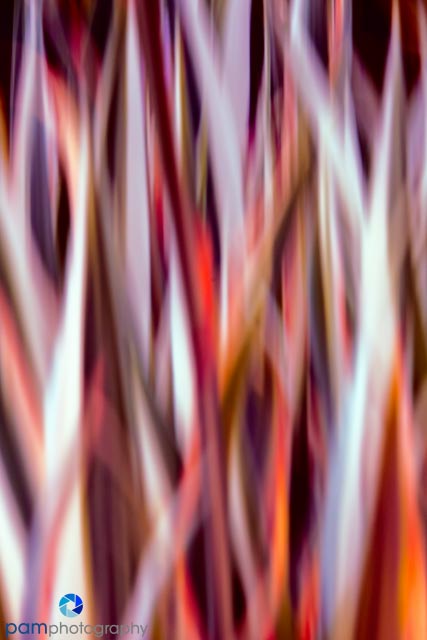
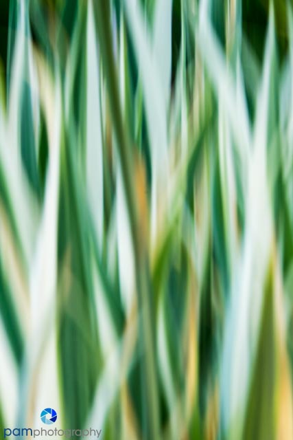
Now to the two images for this week. I captured both these photos at the Denver Botanical garden. The image below was the original capture of the leaves of an iris bed. I felt like it needed more “powerful” colors to match the graphical nature of the strokes. The second image was created with using Restyle. There are many preset options (over 1000) so it can be overwhelming. In fact I was so frustrated the first time I used the plug-in, it was three months before I went back to it……and that because I took the time to watch the intro video and learn how to more efficiently navigate the presets.
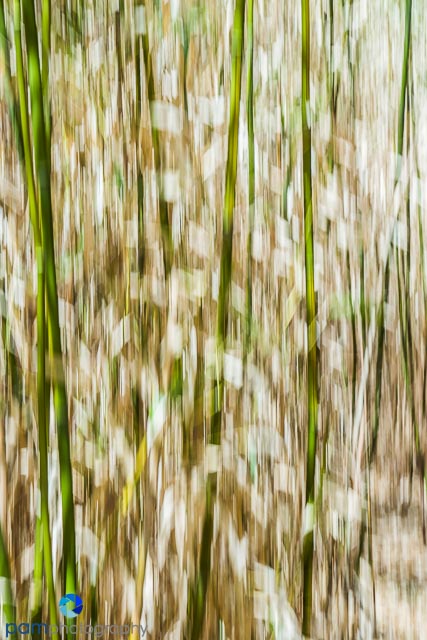
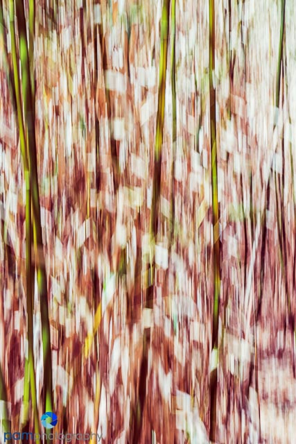
The next image is of a bamboo tunnel. I liked the variation in shapes, but felt the colors were too reminiscent of the “retro 70’s”. The first image is the original capture. In the second image, I prefer the color contrast of the red and green. It adds more depth to the image.

Leave a comment