

This week’s Visual Toolkit project centered on the importance and draw of color, and how to see things differently when the color is removed. I love black and white photography, and my infrared camera has become an important part of my creative tool set, so I wasn’t expecting any “ah-ha’s” this week…….I was wrong.
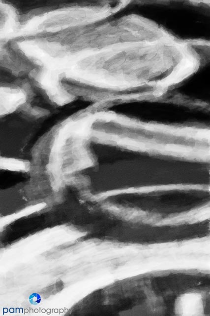
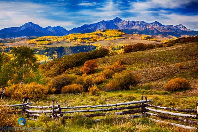
The project was about taking some of your existing photos and converting them to black and white. I picked three photos where I thought color was in integral part to why I really liked the image. I picked an assortment: landscape, portrait, and abstract.


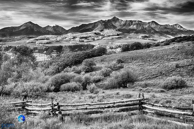
- Variety in tone and texture are important to the success of a black and white image – for me. Many famous photographers like the low contrast look, I prefer something more punchy.
- Not all black and white conversions are created equal. My initial approach was to do a simple conversion in Lightroom. I quickly realized I could not achieve the effects I was looking for and switched to Silver Effects Pro 2 from Nik
- Assumptions aren’t always correct. To be honest I really didn’t think I would like these three photos in black and white. I’m not crazy about the landscape, and prefer the color. But I really like the abstract (which I thought I would hate), and the portrait.
On a different note: A few years ago when I got my first iphone, I immediately started a Project 365 – one iphone photo a day for a year. Looking back on that experience I realized how much my “eyes were opened” to seeing things differently, and creative post-processing techniques. With my new Olliclip lenses in hand, I have decided to give it another go, and started January 1st.. If you’re interested in seeing what I come up with you can follow me on Instagram (Username: maryfandrade). Who knows maybe I’ll even start seeing “in squares” now that I will be posting in a square format.


Leave a comment