

I recently read an e-book by Andrew Gibson called Square. I have been intrigued by square photographs, but never really sure what captured my attention. Was it because they hearkened back to photography decades ago and had a retro feel to them? I set off to find my own answers.
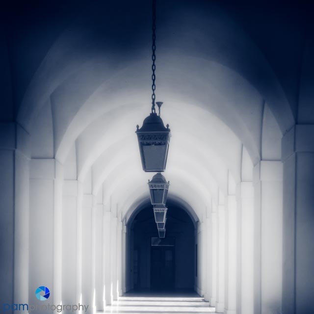
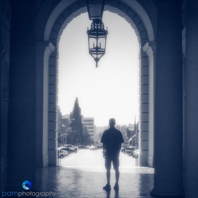
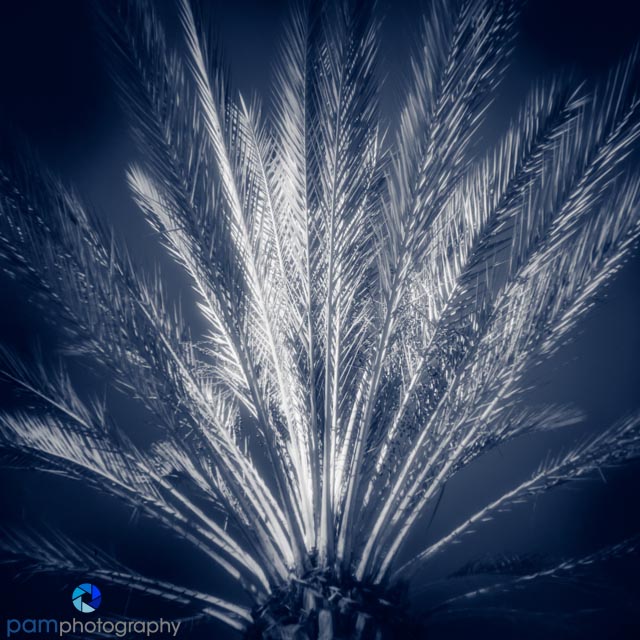
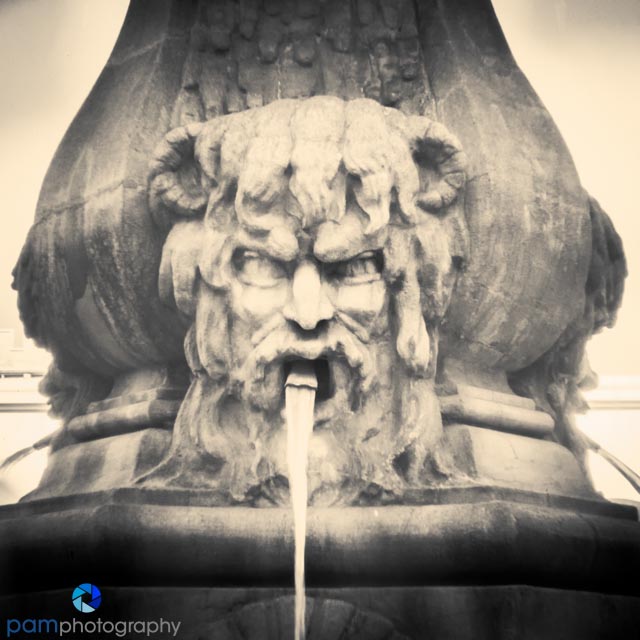
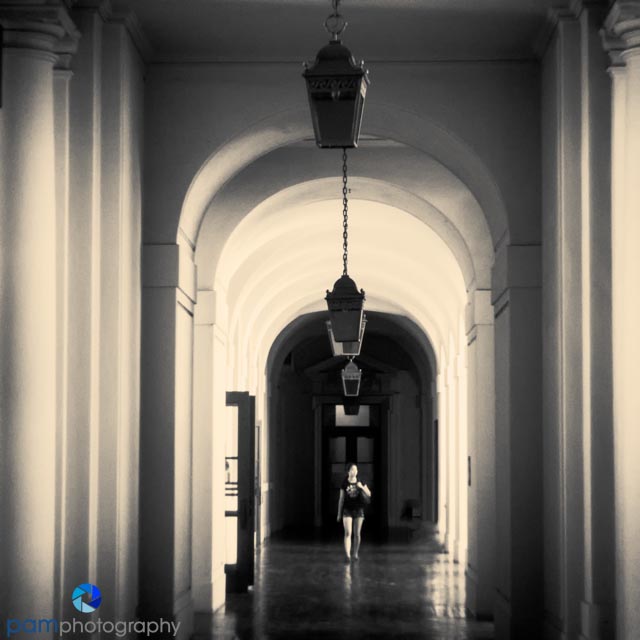
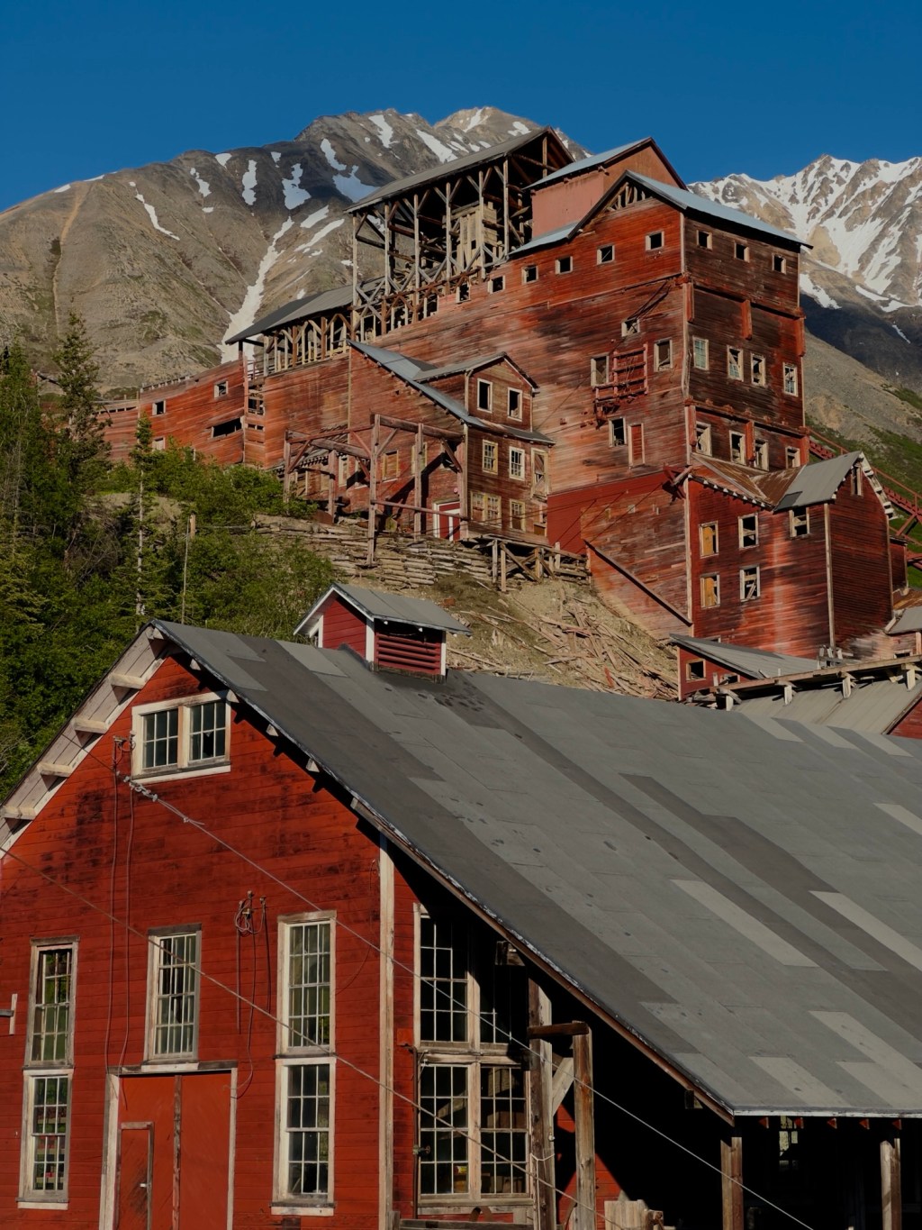
I thought I might as well do it right, so I put on my $20 plastic Holga lens (you can buy these lenses from Holga Direct; they mimic the effect of a toy camera) and set out to find some compelling architecture. I landed on Pasadena City Hall (Part 2 of this post will be San Francisco).
Things I learned
Symmetry works best in the square format. This goes completely against the rule of thirds, and I found I was reminding myself that I would be cropping to a square format. It was a great exercise for keeping the end result in mind.
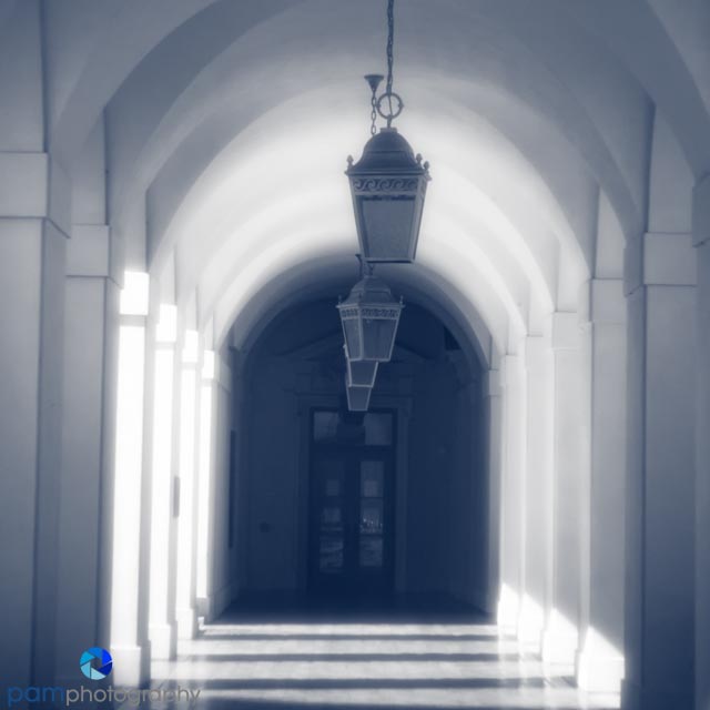
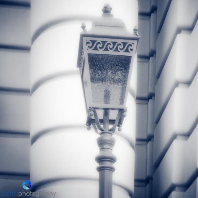
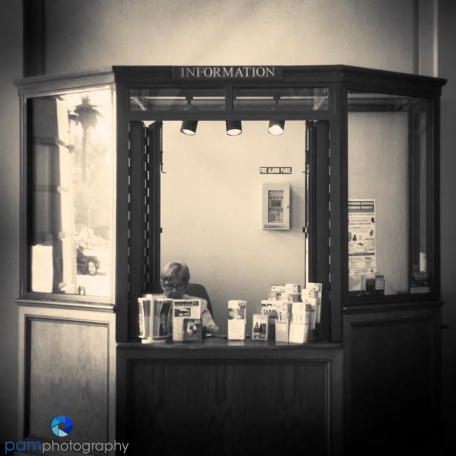
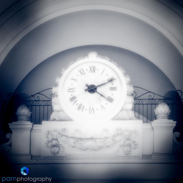
Shapes are important. Because you are minimizing the “real estate” for your image, what gets included must have impact. Strong shapes create that impact, and in a simple way.
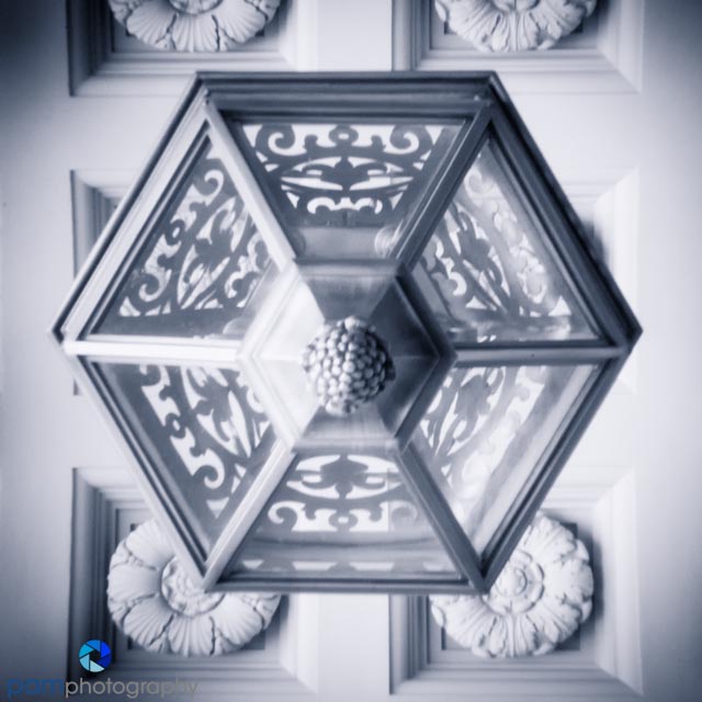
Eliminate clutter. Andrew Gibson talks about simplicity. Eliminate elements that aren’t necessary, focus on “the main thing”.
Dead space. Having negative space works well in this format, it supports keeping focus on the “main thing” and helps to simplify.
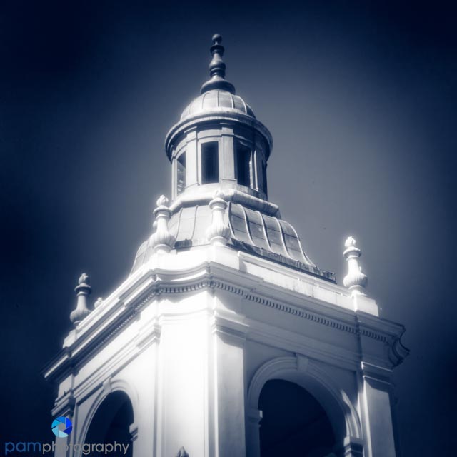
Mono toned images reinforce all of the other elements that make a great square image. When it doubt take the color out (next week, I will show you some where I simplified the color scheme rather than eliminating it).
Here are a few more:


Leave a comment