


Because of software, especially PhotoShop, the line between photography and art is increasingly blurring. People are becoming skeptical of what they see. One of the things that can be frustrating for any photographer when showing photos is the overt or covert accusation that somehow,someway, your photo is “fake” or overly “enhanced” in Photoshop. Most of the time this is done with a simple question, “Did you Photoshop that?” Well, of course I did. It’s called processing. All photos, whether film or digital, need to be and should be processed. I think the more interesting question is how much processing is just right? Too much and the photo starts to look fake or unreal…too little and it looks flat and uninteresting. Here’s an example.
In Michael Freeman’s The Photographer’s Mind (by the way, an excellent book), he sites a study that showed that people like photos that are 10-20% brighter, more colorful, and have more contrast. Therefore, it behooves us to process our photos a bit to create pleasing images.
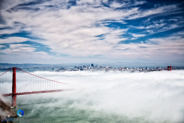
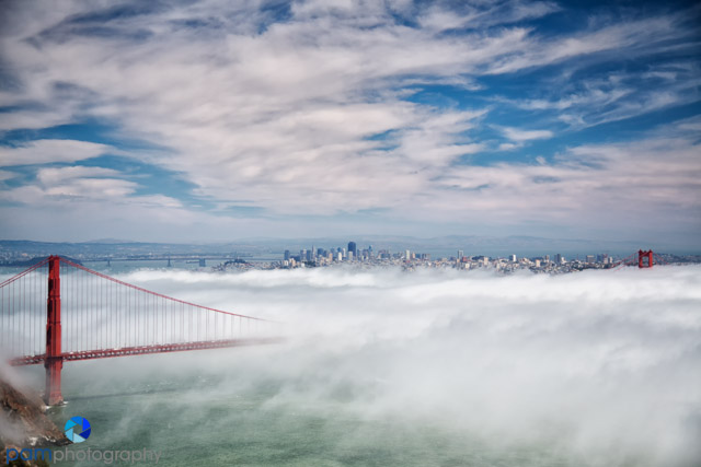
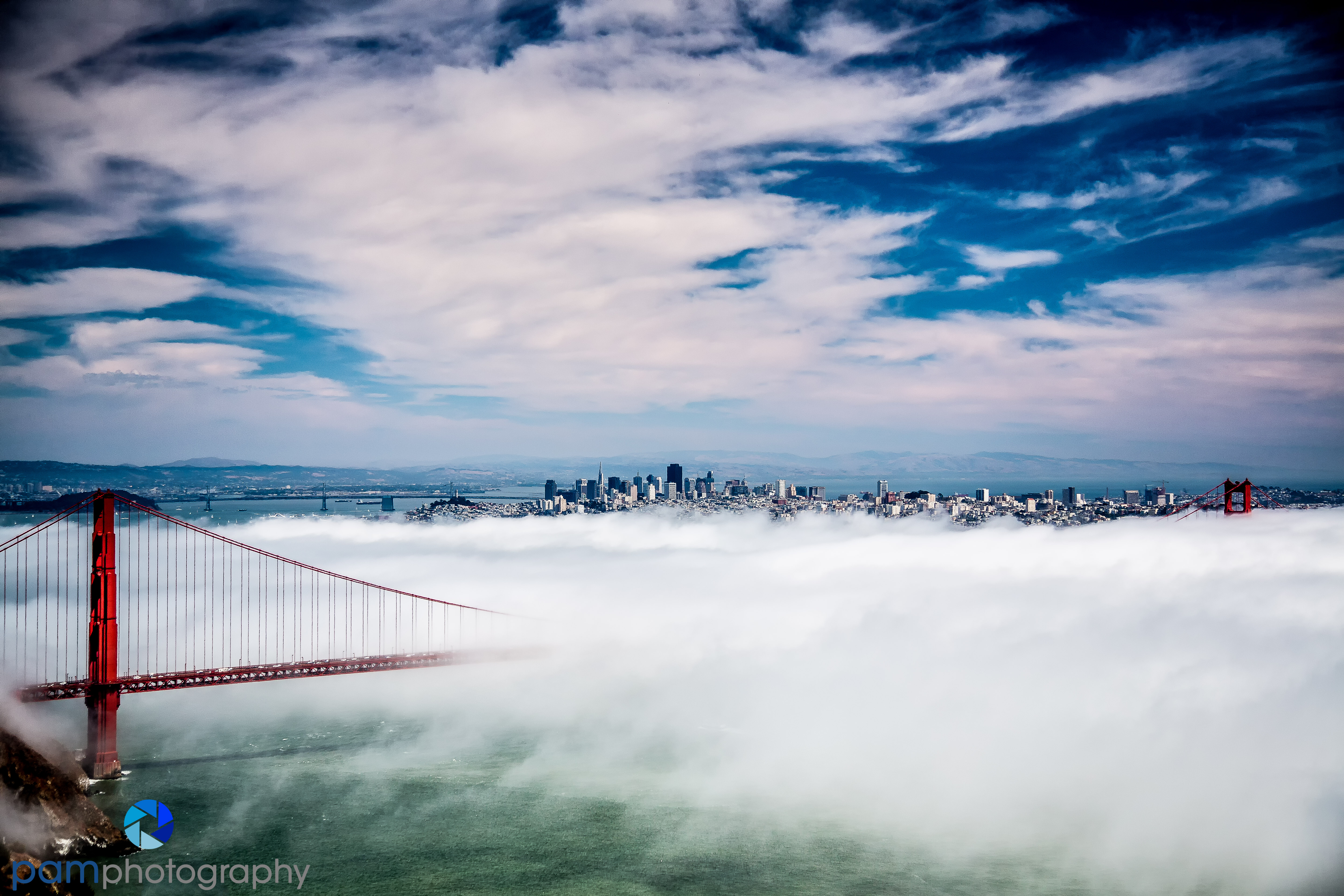
About the photos – The last time Mary and I were in San Francisco, we woke up to the usual summer fog, but I could also see that the East Bay was bright and sunny. We knew that getting up to the Marin Headlands might yield the “classic shot” of the city with the Golden Gate bridge bathed in fog. It was terribly crowded, but we got what we wanted. It was about 3 PM in August, so the sun was behind us, and also high. We did not have the best light of the golden hour, but the bright light worked well enough with the fog and the high wispy clouds.
About the processing – After importing the photos into Lightroom, I set the black and white points. I usually crop in Lightroom, but saw no need to do so here. I then opened up the photo in PhotoShop. I cleaned up the sensor spots and anything else that looked bad in the sky, fog, etc. I reduced the noise with Nik’s Define. I used Nik’s Viveza and increased the contrast and saturation by 15% and structure by 25% to bring out the texture in the clouds and fog. I can do all of this in about five minutes or less.

Often times, at this point, I would call the photo “done.” However, if you have the time and inclination, you can explore different effects in Nik’s ColorEffects Pro and SilverEffects Pro. Mary made an infrared photo, converted it to black and white, and cropped out the sky to make a panoramic look (cover photo).
The photo below has more color saturation and structure.
This one below has even more saturation, contrast and color, but less structure. It still looks “real” to me.

This one has less color saturation, but has more dark contrast that you can see in the fog and clouds.
Finally, here is one processed as a high dynamic range photo. Over-cooked? You decide.
You can not make a good photo with software unless you start with a good one. However, you can make a good photo, great, by processing it well.
See our blog on the five processing steps to making better photos.
To see more of our photos, please go to www.pamphotography.com.

Leave a comment