


I am a big fan of Topaz Lab’s products. I consider them my “creative suite” when I am looking for a unique interpretation for an image. And I love their business model; their price point is affordable and they offer free upgrades from time-to-time.
Now with that out of the way, when I bought Adjust 4 I didn’t use it. I thought it offered basic processing functionality that I would use other programs for and didn’t really understand it’s potential. When the free upgrade to Adjust 5 came out, I decided in the spirit of keeping my software current to take advantage of the offer, but didn’t really anticipate it would change my mind. It wasn’t until I took Deb Sandidge’s on-line course in Enhancing Images and Creating Works of Art that I really understood the power Topaz Lab’s Adjust 5 would give me. The photos in this post should give you a sense of the broad range of options available. It has become one of my “go-to” plug-ins.
The Interface
The program’s interface follows a typical format and is easy to use. Presets are on the left; fine tuned adjustments are on the right. I do have difficulty at times with the adjustments – the names aren’t intuitive and the changes can be strong. For example, sometimes I notice color banding when I pick a particular preset. I used to guess at what adjustment was causing it, or tried to smooth it out in Photoshop. Recently, while watching a tutorial where the “Process details separately” box was checked I noticed it helped, so I will begin to try that going forward. One of the things I like about Topaz Lab is it’s on-line help videos. They post them on a YouTube channel and you can subscribe and to receive weekly updates about new videos.
My Only Complaint
Ok, before I dig in, I just want to emphasize that I really do love this software. There are times when I work in Adjust 5, save and exit, and then see changes to my image in Photoshop that don’t match what I had before I exited the plug-in. Usually they are more muted or subtle then what I had achieved within the plug-in. This doesn’t happen very often, and I have no idea what causes the discrepancy.
Sample of Different Effects
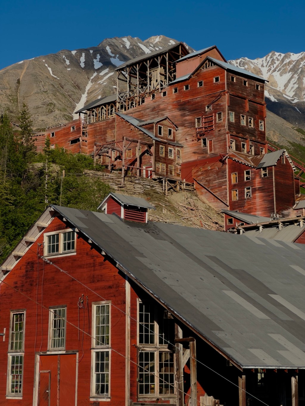
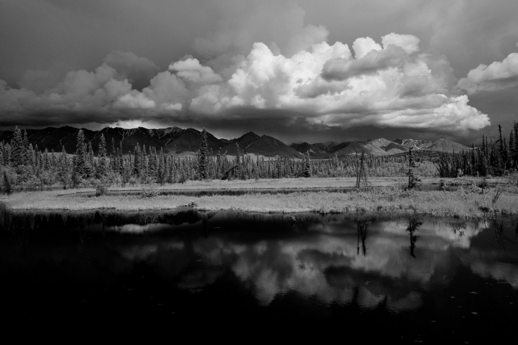
Now for the fun stuff. I’ve picked an assortment of images that I processed using Adjust 5 to give you a sense of the versatility of this software.

One of my favorite uses of Adjust 5 is to accentuate the color in an image. I usually combine an extreme color effect with a smoothing effect or a sharpening effect….or all three. The bowling sign above is one example, here are a couple more.


There are also options to take color out and create a more toned image. You may have seen the colorful ceiling at the Bellagio. For this image I created a more monotone look using my color infrared camera (I have also created amazing surreal colorful images with my infrared photos using this software as well)


One technique I like to use is to duplicate my source image on a new layer (I do this for all work in Topaz Lab’s products so that I can easily manipulate the result), and then adjust the opacity or use blending modes to bring back some of the source image. For example, the abstract below was created using the “liquid chrome” preset which removed all the color and accentuated the shapes. When I brought it back into Photoshop I used a blending mode that would bring back the color and create an image that emphasized both color and shape.

Lastly, I like to use this software to “swap” color information. They have a great selection of cross-processing and retro effects. When I took this image of the river reeds, there was no purple in the original scene. By using a cross-processing preset, I was able to introduce a purple color that balanced nicely with the golden tones of the reeds.

Topaz Lab offers a free trial period. To learn more click here.


Leave a comment